Bread & Butter
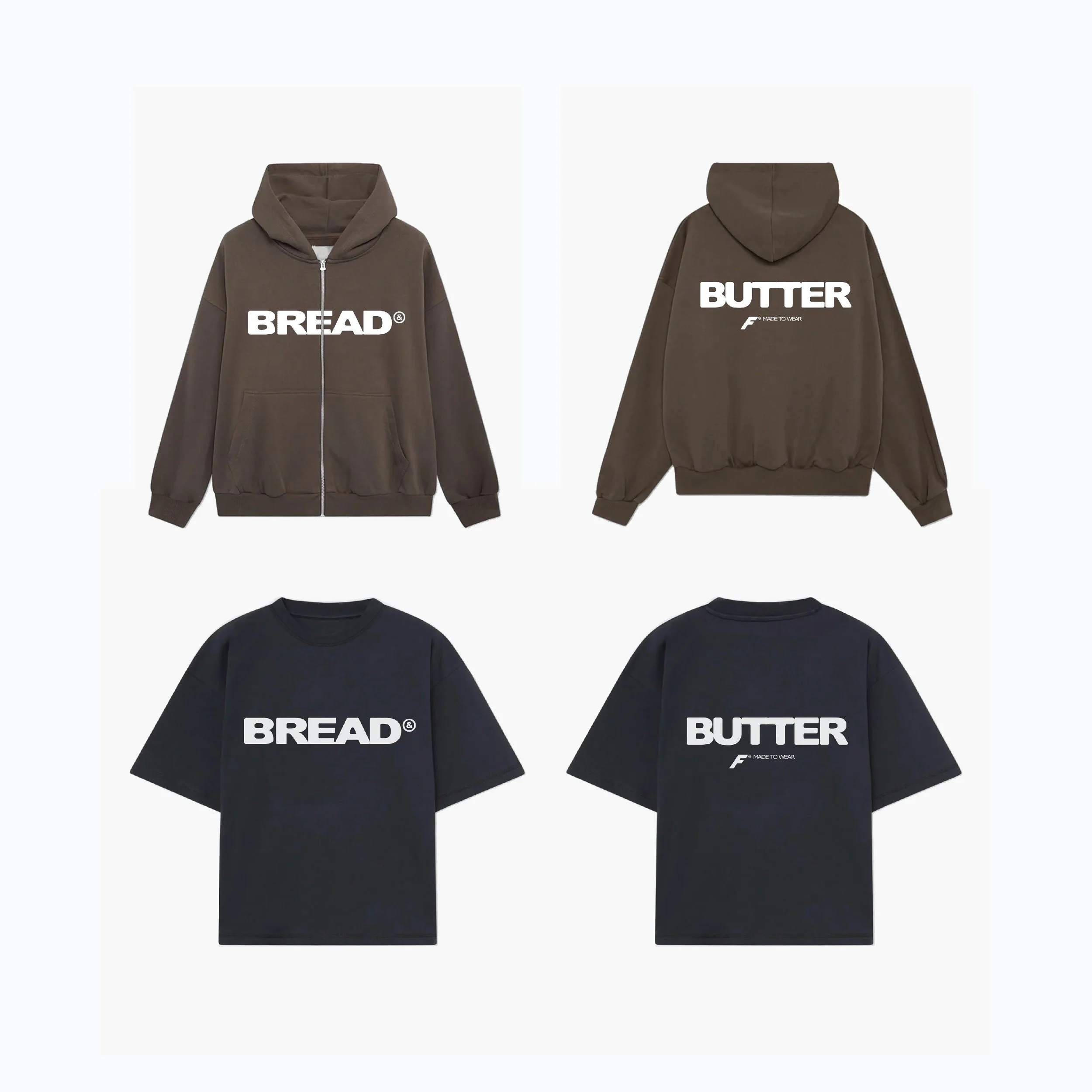
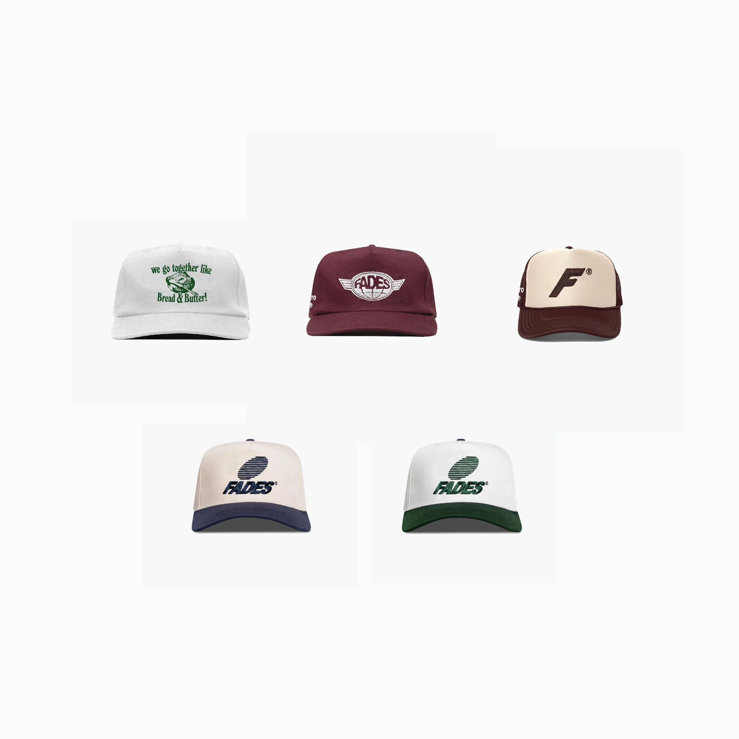
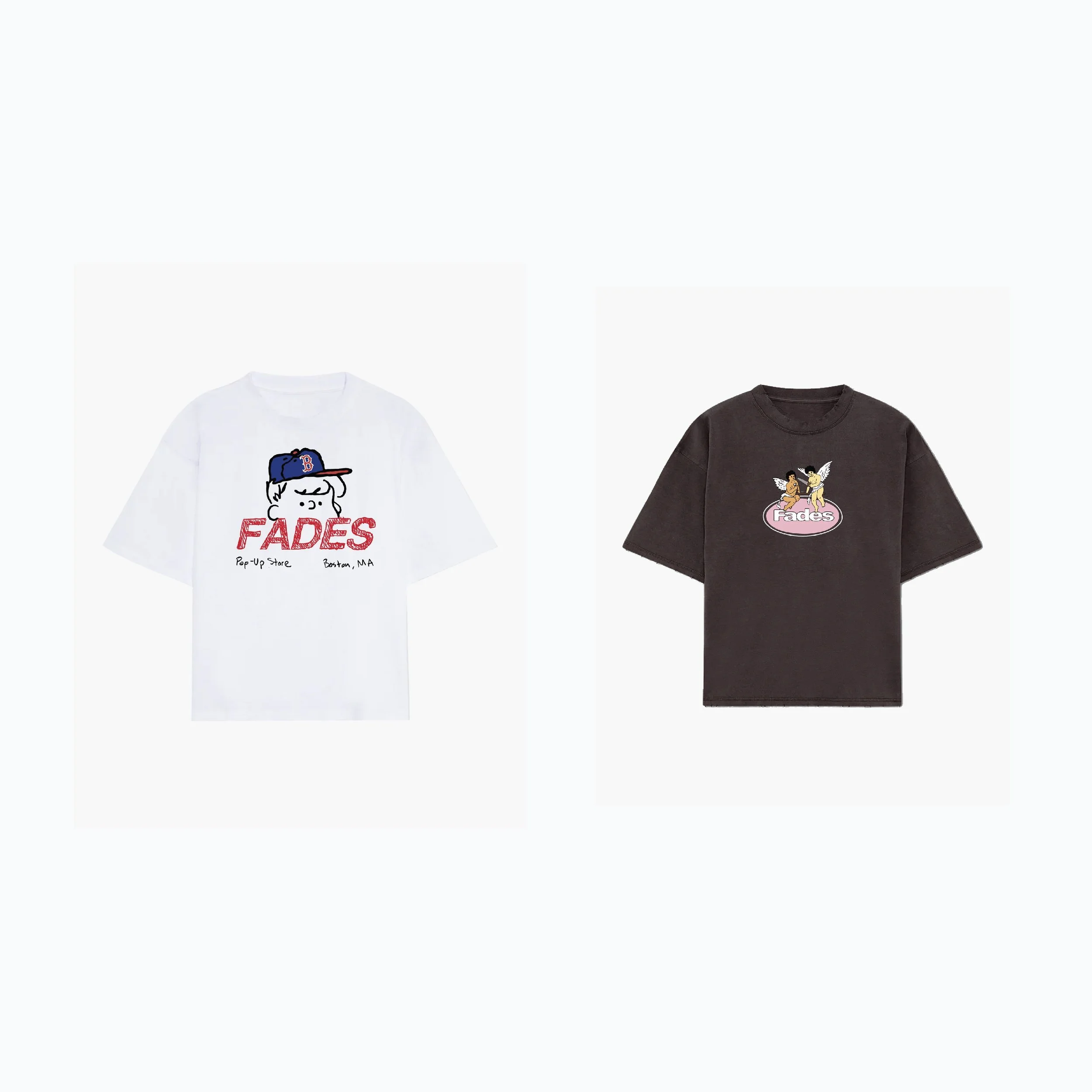
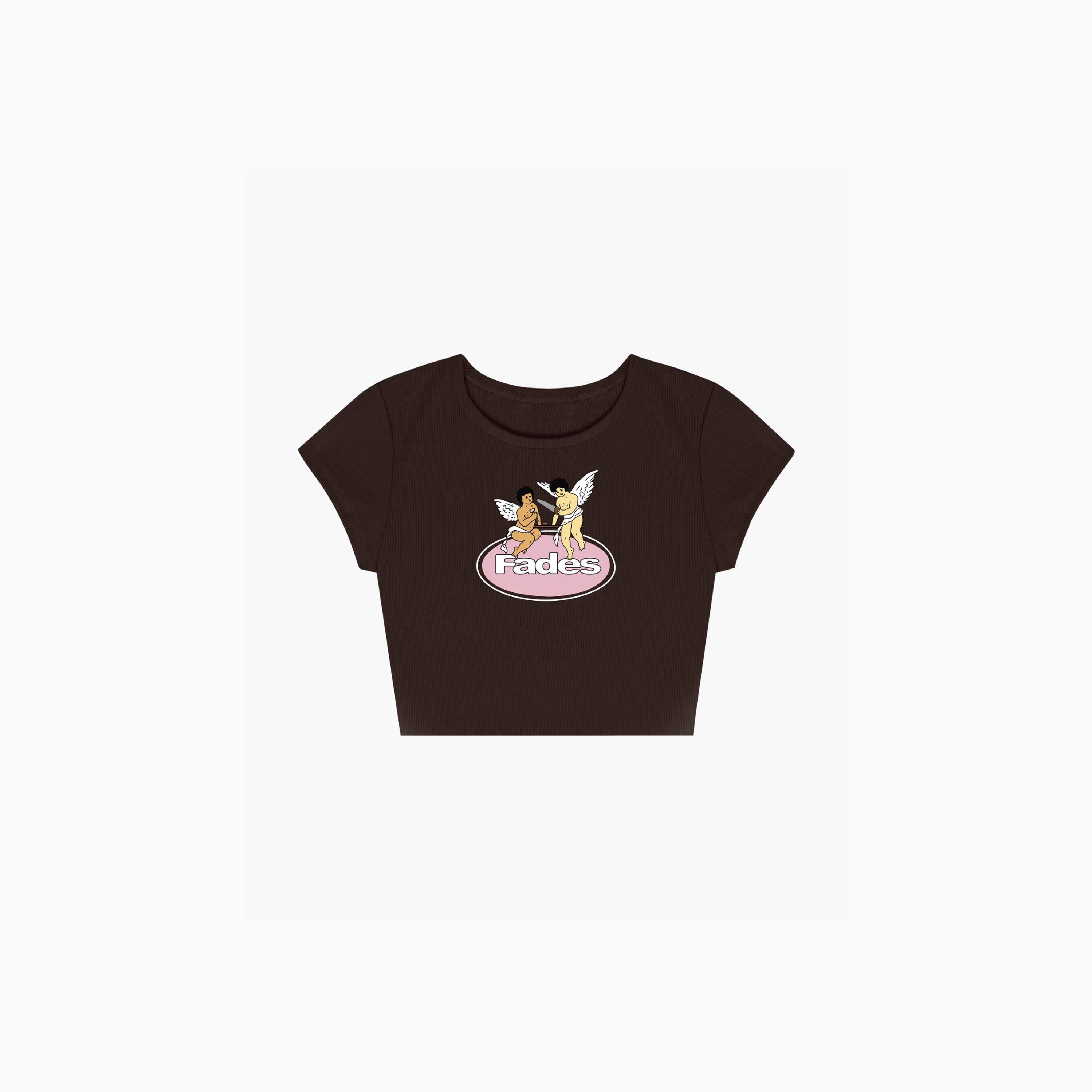
Bread & Butter was the first collection released in 2024 for my brand, Fades. The collection featured three hats, four T-shirts, and a hoodie, each designed to embody the essence of the collection’s purpose: to introduce timeless, versatile clothing. My goal was to create pieces that were simple, easy to wear, and staple garments in customers' wardrobes—reliable and consistently satisfying, much like the pairing of bread and butter.
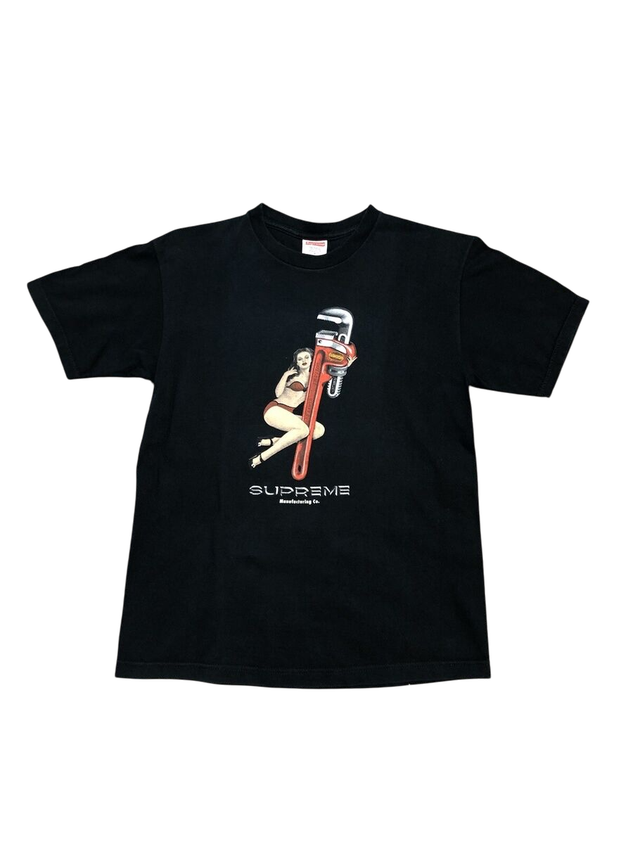
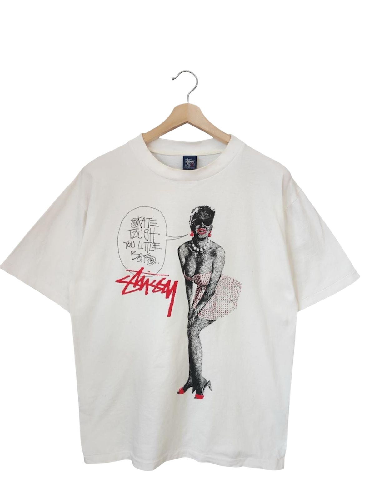
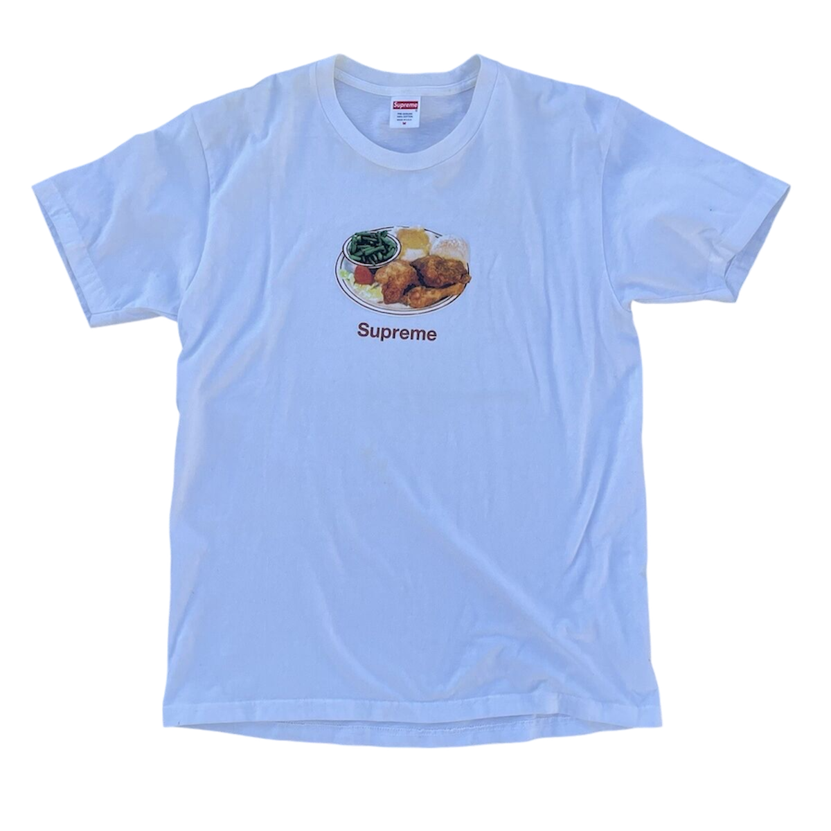
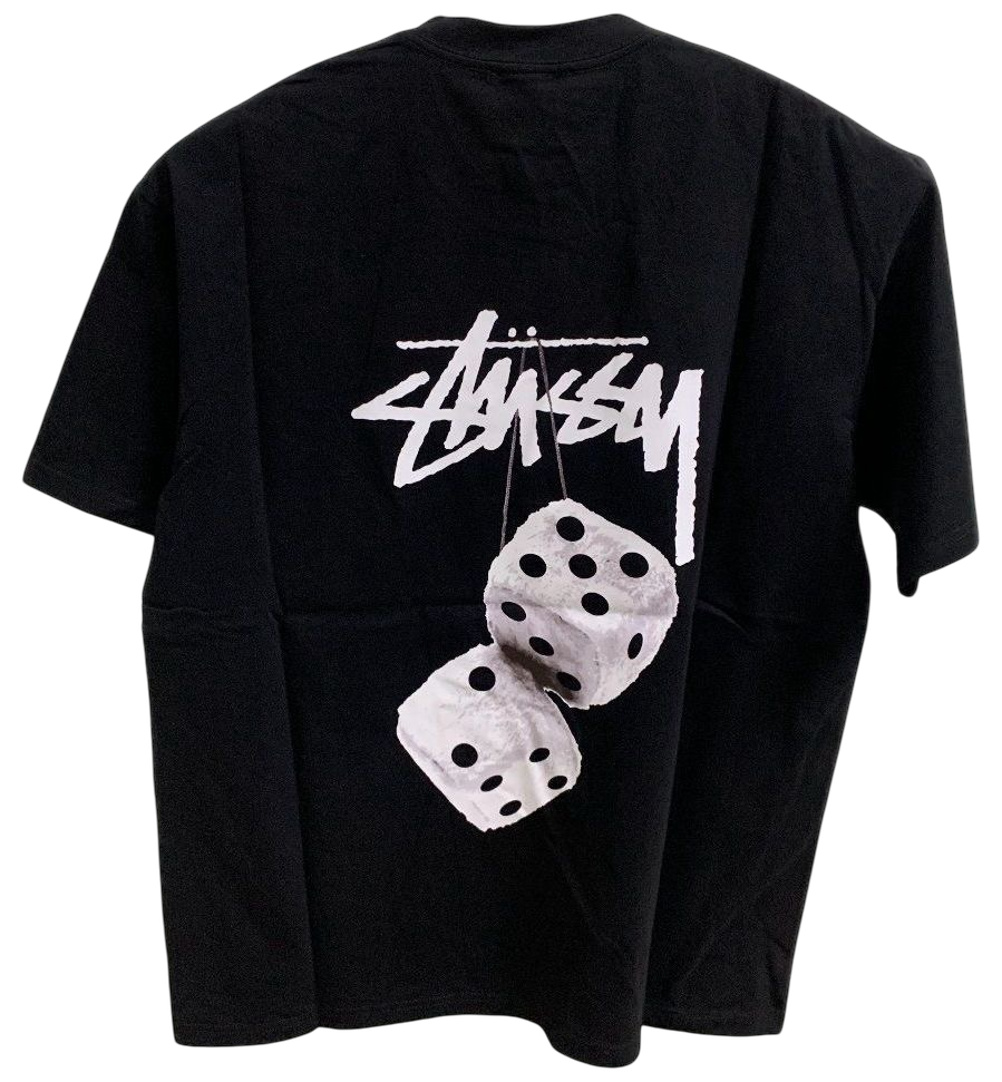
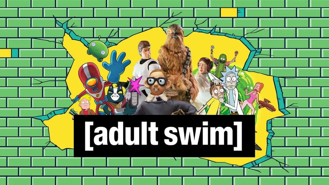
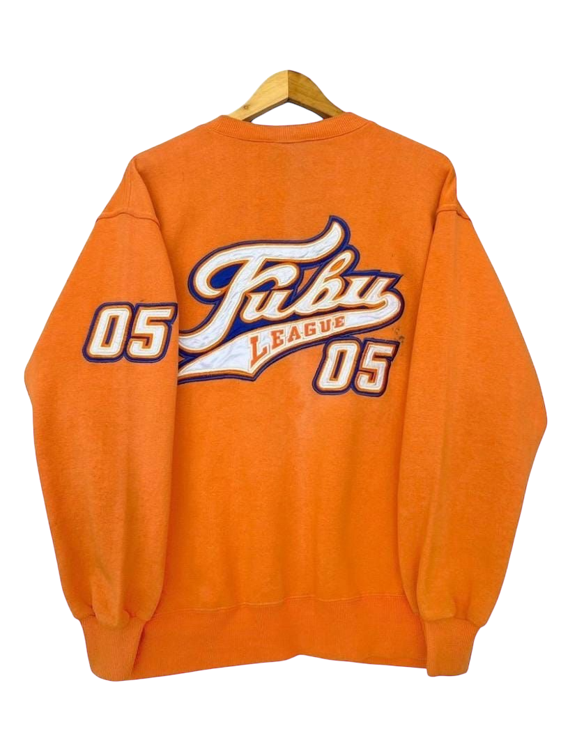
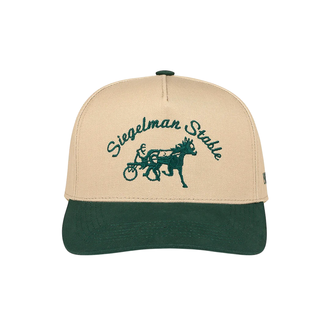
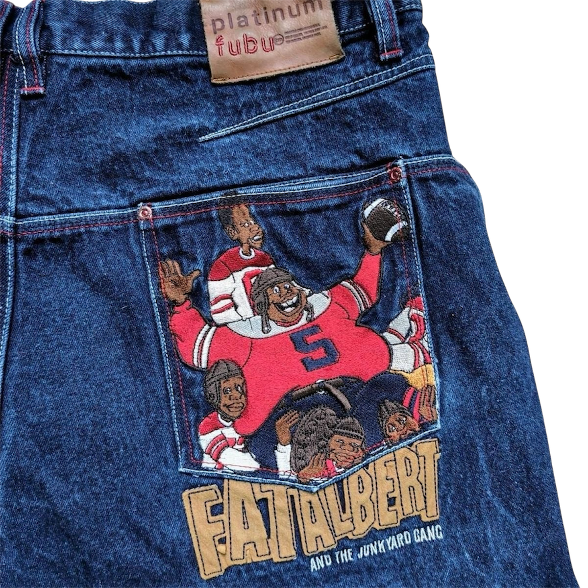
The Bread & Butter collection was inspired by what first sparked my passion for fashion and streetwear. As a Black American, I see streetwear as the cornerstone of fashion across cultures—a style I’ll never outgrow or dismiss as immature, unlike those who have exploited its brilliance. Rooted in vintage streetwear, iconic brands like FUBU, Supreme, and Stüssy shaped my vision with their bold, comical, and relatable graphics. The irreverent humor and unapologetic style of [adult swim] also influenced the graphics in this collection. I also took inspiration from what has become a popular snapback style on the two color blank hats. Popularized most recently by brands like Siegelman stable.
Inspiration
Once I solidified the direction, I reworked and created new designs in Adobe Illustrator, blending the inspiration with my own personal touch to build a strong foundation for the design process. After sourcing blanks, I collaborated with local screen printers and embroiderers to bring the designs to life, ensuring each graphic was perfectly matched to its intended garment. To insure vendors understood my vision, I provided them with CAD’s and graphic placement.
Process
Angels At Work embodies the brand phrase, “Made to Wear”. They’re constructing the garment/logo
Exclusive reworked peanuts graphic that was used on Tee’s only sold at the Fades Pop-Up event in Boston.
This is one of the standard logos used on the hat. The thumbprint represents the idea of leaving your mark behind wherever you go.
Fades Global logo. Inspired by more of a patch concept rather than just a regular embroidered logo.
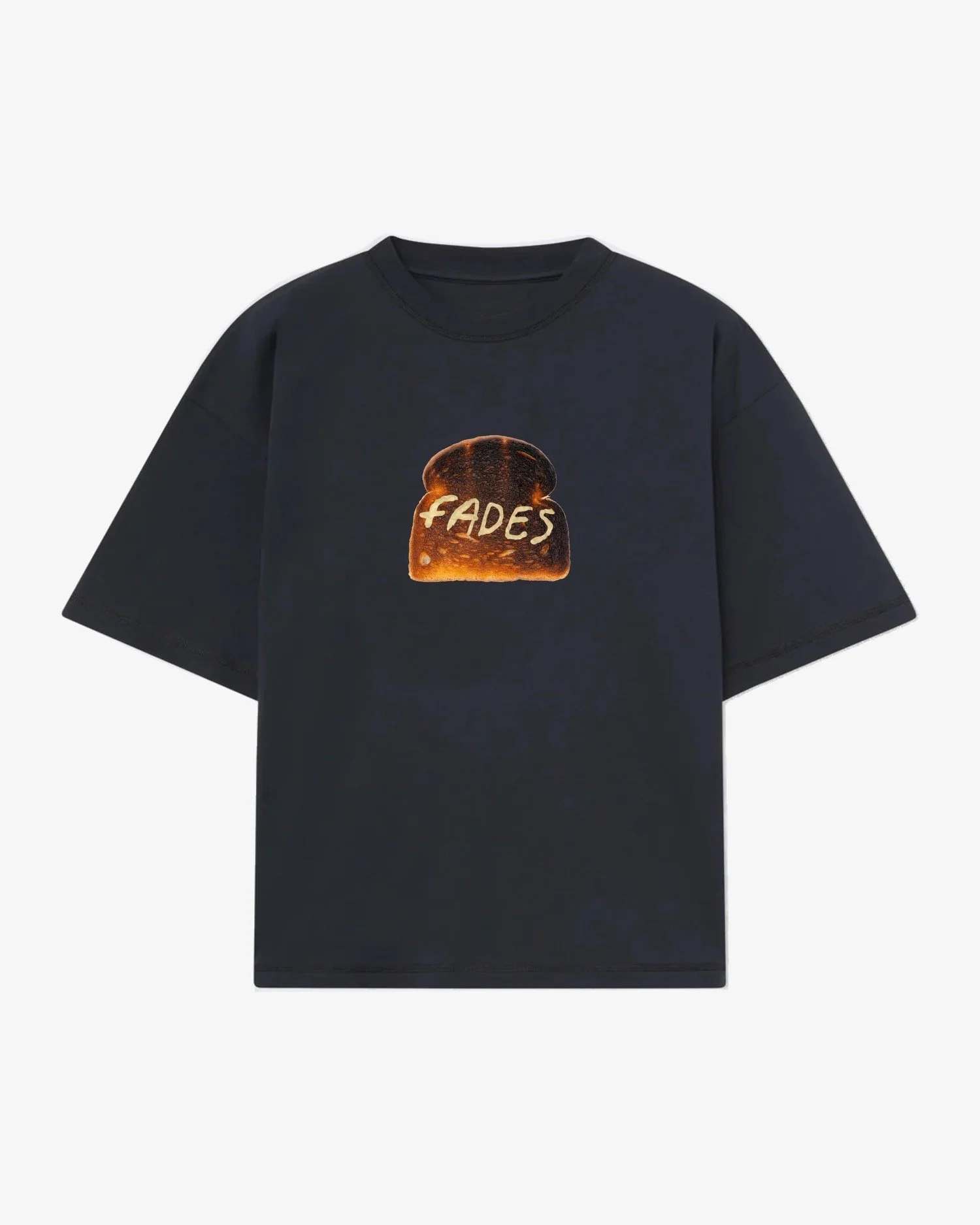
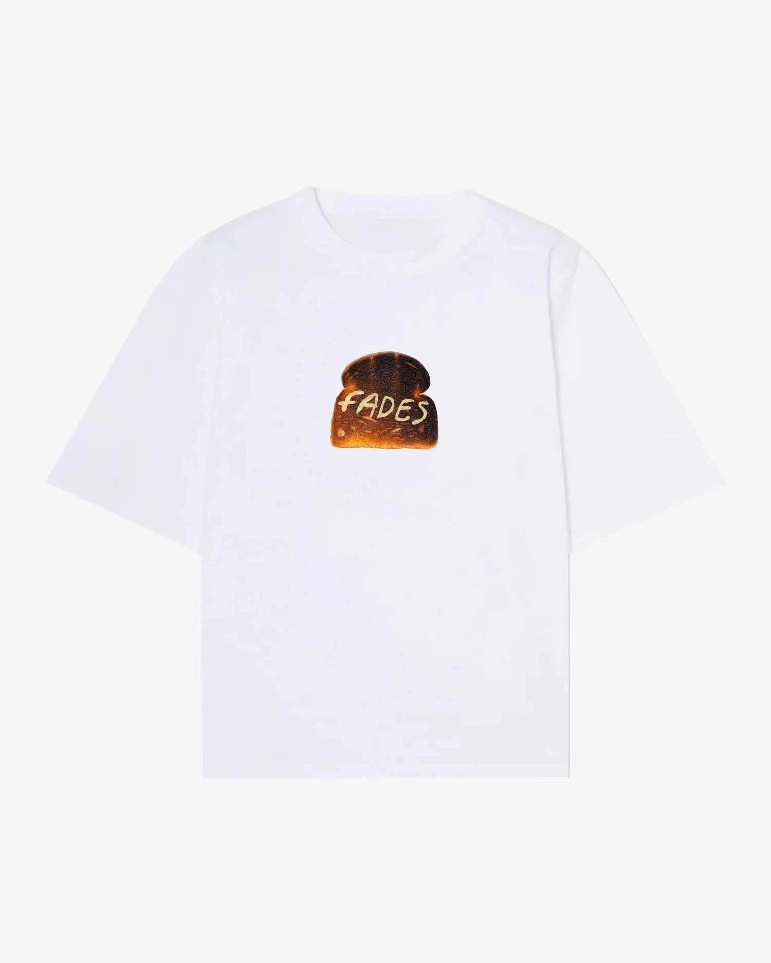
Toast graphic is symbolically literal. Bread with Fades spelled out in Butter.
On the side of the Thumbprint hat, this logo bring a little class to what is otherwise a very playful collection of images.
Bread logo was placed on the front, with butter on the back of our hoodie and tee. Using the “&” symbol instead of the restricted or trademark symbol added a layer of detail to design that made it a little more unique
Standard “F” Logo used on the Trucker hat from the B&B collection.
The final product arrived, meeting the requirements to complete production. The primary challenges involved understanding the cost differences between DTF printing and screen printing, which required me to balance my vision without sacrificing quality.
Printing over zippers posed another difficulty, especially on garments with unsuitable zippers. The ink would bleed into the zipper teeth, affecting functionality. This issue was resolved by quickly sliding the zipper back and forth on each hoodie to break through the ink and restore smooth operation.


