Here lies a collection of flyers that I designed for different fashion, music, and personal events. All done in. photoshop and adobe illustrator.
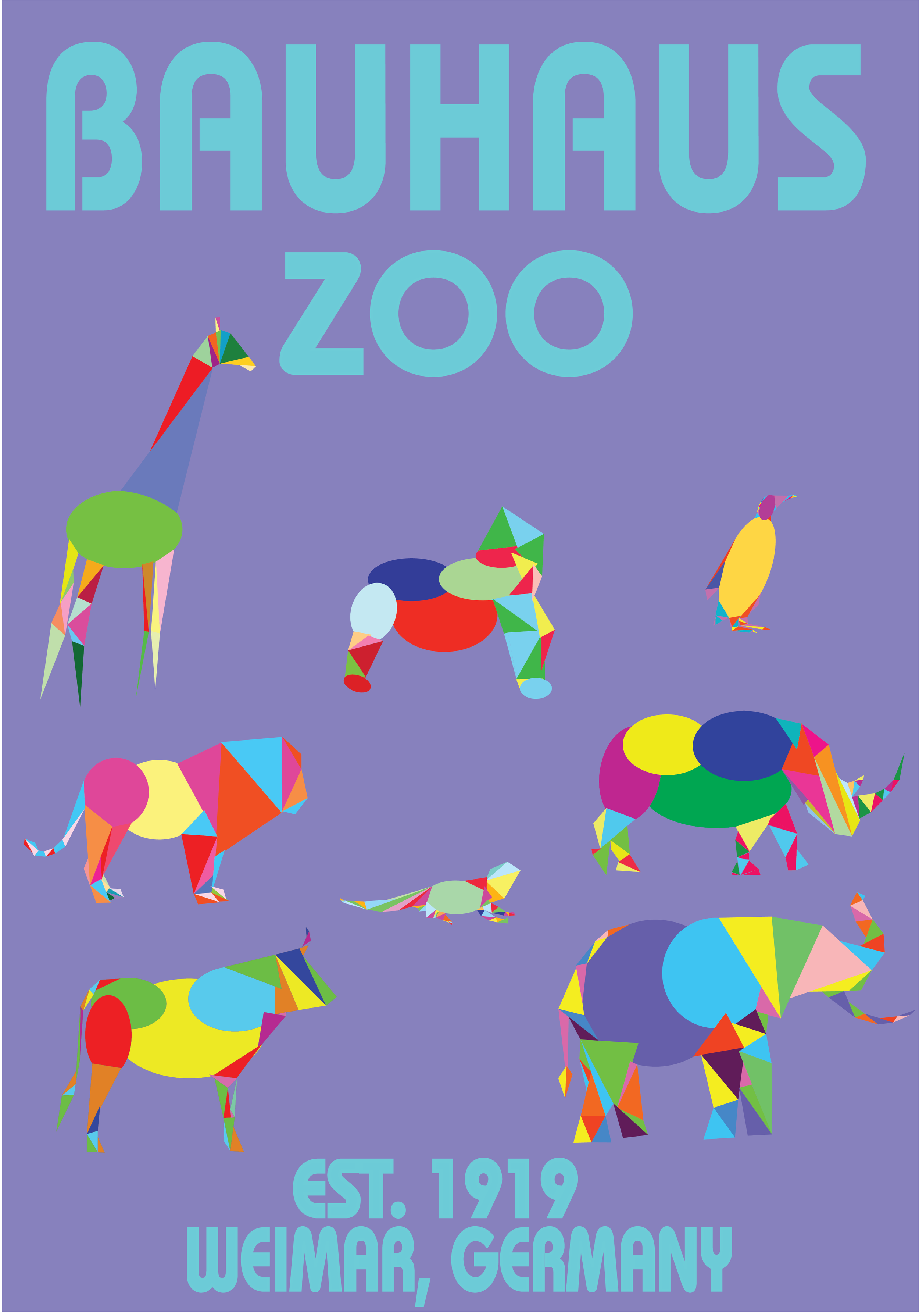
Bauhaus Zoo
I created a flyer for a fictional zoo featuring animals constructed entirely from triangles, circles, and ovals, inspired by the Bauhaus art style. While visiting Copenhagen, a friend introduced me to Bauhaus, sparking my interest in its unique aesthetic. Intrigued, I began researching the movement, though I wasn’t entirely sure what I wanted to create at first.
Knowing that Bauhaus originated in 1919 in Weimar, Germany, under architect Walter Gropius, I felt it was important for my project to pay homage to its origins. The Bauhaus style emphasizes functionality, minimalism, and geometric shapes, which inspired me to use basic forms like circles, ovals, and triangles as puzzle pieces to construct the animals.

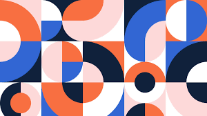
Using Adobe Illustrator, I started with side-profile images of various animals, tracing them on a separate layer with these geometric shapes. I carefully chose shapes that would best capture the essence of each animal's form while staying true to the simplicity of Bauhaus. My color choices were mostly intuitive, though I often considered how different colors complemented one another.
The most significant challenge was aligning the shapes perfectly—ensuring corners and curves met seamlessly. Initially, I became fixated on these details but soon reminded myself that this project was meant to be fun and spontaneous, a lighthearted experiment inspired by recent inspiration. Embracing the core principle of Bauhaus—simplicity—I avoided overcomplicating the process, allowing creativity to take the lead.
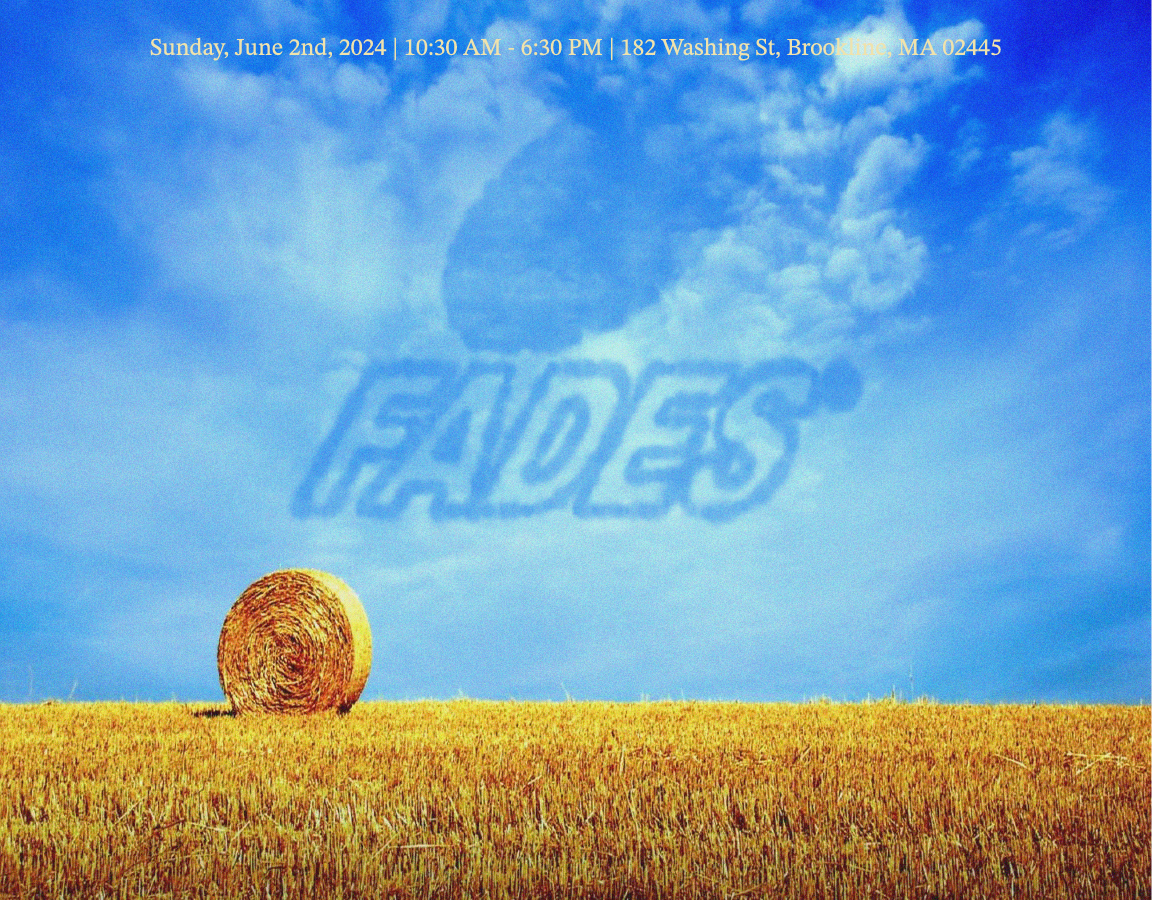
FADES
This flyer was created for my clothing brand, Fades, to promote our first pop-up event in 2024. The design features the company logo etched into the sky above a wheat field, reflecting the art direction of our debut collection, Bread & Butter.
As our first collection and event, this moment symbolized the birth of the brand. The theme, Bread & Butter, draws inspiration from the growth process—bread begins with cultivating a field, and even dead grass contributes to fertilizing a strong foundation. This imagery aligns with Fades’ philosophy of growth, resilience, and building from the ground up.
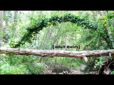
The design was influenced by the television channel [adult swim], known for their loading screens featuring serene nature scenes with subtly integrated logos. I admired the understated elegance of their branding, which avoided being overly assertive. Similarly, Fades embraces a more organic approach, letting the product and experience speak for themselves without being forceful or overstated.
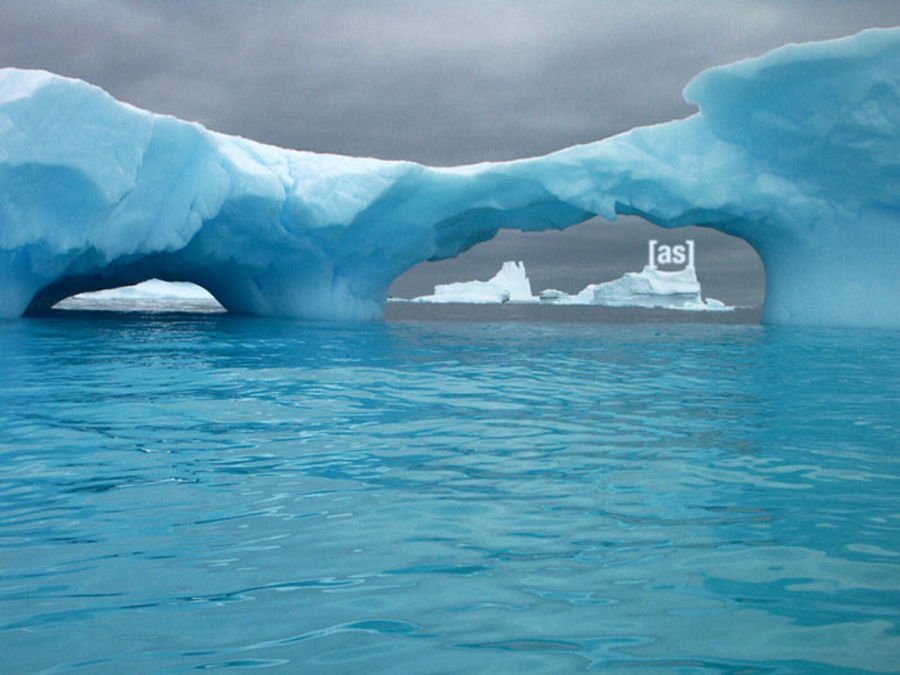
All my work was done in adobe illustrator and photoshop. There, I added different textures and grains to add more visual stimulation to the image. With the help of this relatively outdated youtube video, I followed instructions, but inverted the result so that the logo is cut into clouds rather than made out of clouds
Challenges came from having to use photoshop more than illustrator. Photoshop gives less movement and flexibility, but is superior in instilling visual affects to a graphic. Having
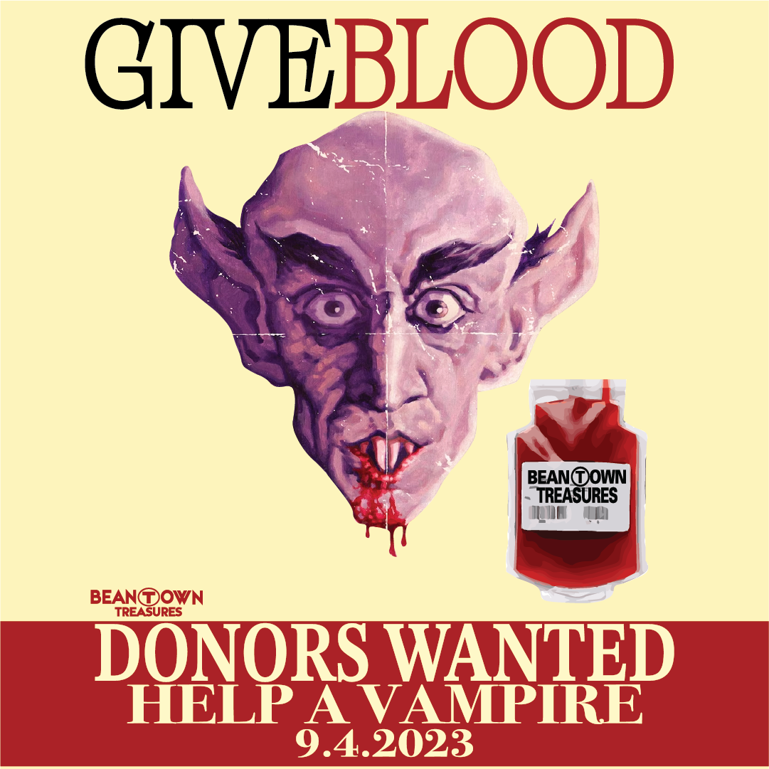
Nosferatu Blood Drive
This blood drive poster was designed to announce the release of a new graphic tee for my other brand, Beantown Treasures. The concept drew inspiration from vintage blood donation tees and posters that I had curated and sold as part of my vintage collection. The goal was to create something lighthearted and comical while paying homage to the nostalgic designs that inspired it.
adjustments!
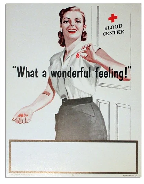
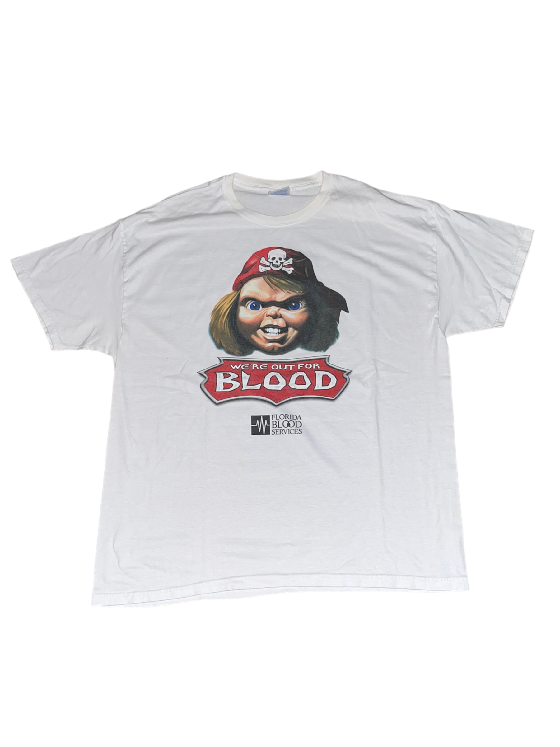
The majority of my work was done using Adobe Illustrator and Photoshop. By leveraging tools like the clipping mask, image trace, and various settings and layers, I was able to create the desired texture for the vampire. The goal was to craft a design that looked authentic enough to hang around the city, as if it were promoting a real blood drive.